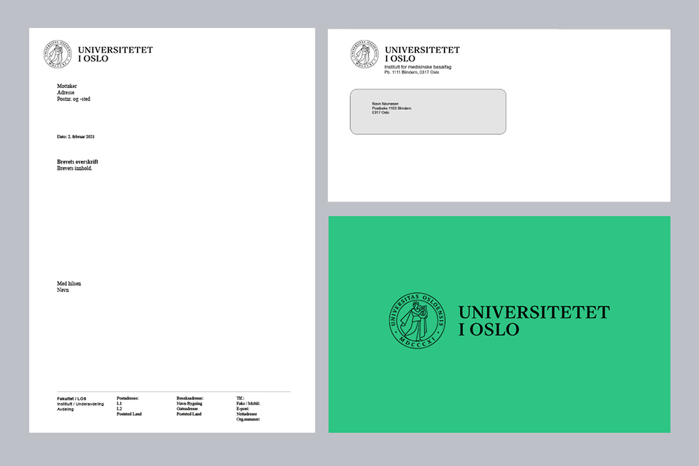
The logo of the University of Oslo is our most important signature. It signals identity and ownership, and ties together all our activities.
Here you find information about how UiO's logo should be used, and logo files of different kinds for download.
One logo
The University of Oslo has one logo, and all units must be profiled under this (monolithic model). The names of faculties, institutes or senters are not part of the logo, but can be included in a designated field below it.
Units at UiO should not make their own logos or brands.
How to use the logo, name and seal

UiO's logo contains two elements:
- the name ("University of Oslo")
- the seal with Apollon.
The logo must always be complete. This means that both the name and the seal always must be visible on a surface or a product.
On UiO's own graphic material, including posters, brochures, reports and info screens, the logo may be split so that the name is placed in the top left and the seal in the lower right corner. On products such as sweaters and cups, the name feature can be on one side and the seal on the other.
In formal communication, in cooperations with others and on external surfaces, we must always use the complete logo.
Use of full logo
- The logo is either black or white, but can be used on a coloured background.
- The logo must be placed in a certain distance to other meaningful elements. In size, this corresponds with half of the diameter of the seal.

Use of the name
In cases where the name can be used separately from the seal, the following guidelines apply:
- The name is either black or white, but can be used on a coloured background.
- The name should as a rule be placed in the top left corner of a surface.
- The name must be placed in a certain distance to other meaningful elements. In size, this corresponds with half of the height of the letters in the name.
Use of the seal
In cases where UiO's seal can be used separately from the name, the following guidelines apply:
-
The seal is black or white. It should not be coloured in any way, but can be used on a coloured backround.
-
A red version of the seal is in use on official diplomas and as a profile picture for UiO's official social media channels.
-
The seal may be used on images, but make sure the background behind the seal is calm.
-
The seal should as a rule be placed in the bottom right corner.
-
The seal must be placed in a certain distance to other meaningful elements. In size, this corresponds to half of the size of the diameter of the seal.
-
The seal may be used as a decorative element, but never in a pattern where multiple seals are put together.
- The contents of the seal must not be altered.
- The smallest permitted width of the seal on printed materials is 15 mm. Should certain products require smaller sizes, contact the Department of Communications and External Relations at designmanual@admin.uio.no.


Download logo, name and seal
UiO's seal
 UiO's seal shows the god Apollo with the lyre. Apollo was chosen for the seal in 1828, but used for the first time in 1835.
The circle around Apollo contains the university's Latin name, Universitas Osloensis, and its founding year 1811 written in roman numerals.