
In "Shorty got low" we showed a video of us achieving a low orbit. However, the video does not really prove anything. We might as well have crashed after that video and you would never know. I pulled out some data of our position while cruising in orbit around Lajaland.
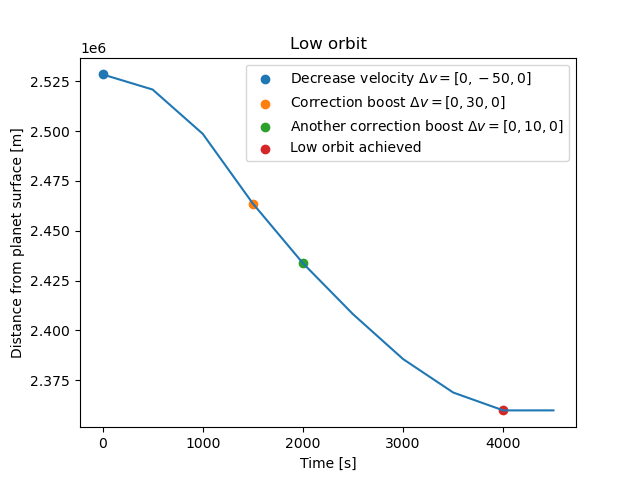
This figure show our spacecraft's position relative to planet surface while descending into a low orbit around Lajaland. The blue dot is where Genie Nils placed us in stable orbit and where we begin to decrease our velocity to in order to fall down, as seen from the sinking graph. Two correction boosts where done along the way (orange and green dot) because we were falling too fast and there was a risk of crashing. The red dot is where we achieved a stable orbit and our distance to planet surface remains constant after that. Great!! Onto the next cool figure.
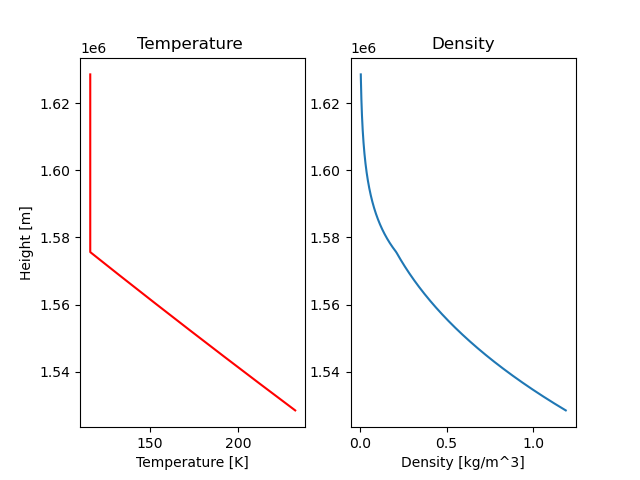
Remember the atmosphere model we tried to make in "An atmosphere walks into a bar...", but just could not finish? We actually managed to find an analytical expression AND create a lovely figure. Quick recap; we earlier found three expressions
- \(\frac{dP}{dr} = -\rho(r)g(r)\), pressure
- \(P(r) = \frac{\rho(r)kT(r)}{\mu m_H}\), density (use algebra manipulation to get an expression of \(\rho\))
- \(T(r, \gamma) = \begin{cases} C^{\frac{1}{\gamma}} P^{1-\frac{1}{\gamma}}&\mbox{} \text{heights up to where } T = \frac{T_0}{2} \text{(adiabatic)}\\ \frac{T_0}{2} & \mbox{ } \text{else (isothermal)} \end{cases} \), temperature (corrected version to make it easier to read)
The constant C could be found using initial values (values on planet surface) of pressure (P) and temperature (P) and NOT density (\(\rho\)) like I said in the post... Sometimes P and \(\rho\) looks similar...
Here are the initial values and the C calculated:
Surface temperature of destination planet is 232.4729158736017 K
Atmospheric density at the surface is 1.187753687673637 kg/m^3
C: 23.28060684843753
How it is made: atmosphere model
Do you remember Euler Cromer and how we used previous values to calculate new ones? If not read it here. We used the same type of logic when setting up the integration method for the atmosphere. The algorithm is as follows:
\(P_{new} = P_{previous} + (-\rho_{previous}\cdot g_{previous}\cdot dr)\)
\(T_{new} = C^{\frac{1}{\gamma}}P_{new}^{(1-\frac{1}{\gamma})}\) for heights up to \(T = \frac{T_0}{2}\) otherwise \(T_{new}=\frac{T_0}{2}\)
\(\rho_{new} = \frac{P_{new} \mu m_H}{kT_{new}} \)
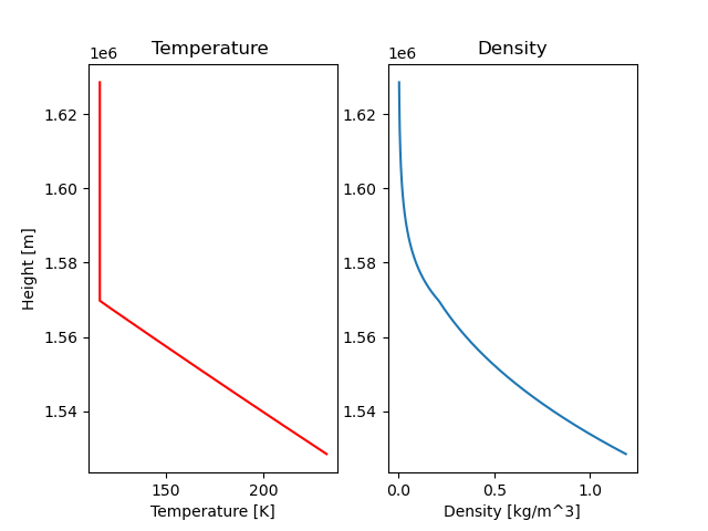
Density: Looks lovely! On the graph you can see a slight bend where the atmosphere goes from being isothermal to adiabatic (or the other way around, depends if you read from above or below).
Temperature: As expected the temperature is constant for heights above \(T = \frac{T_0}{2}\) (isothermal) and decreases linearly for heights under that (adiabatic). In the post about atmosphere I expected and drew the adiabatic part more curved instead of a straight line... I really do not know why. I must have been very tired.
Here's the catch; the model was based on gases we assumed the atmosphere consisted of. Just a wild guess. We never actually managed to find the gases... or did we? (kind of)
Actual gases in our atmosphere
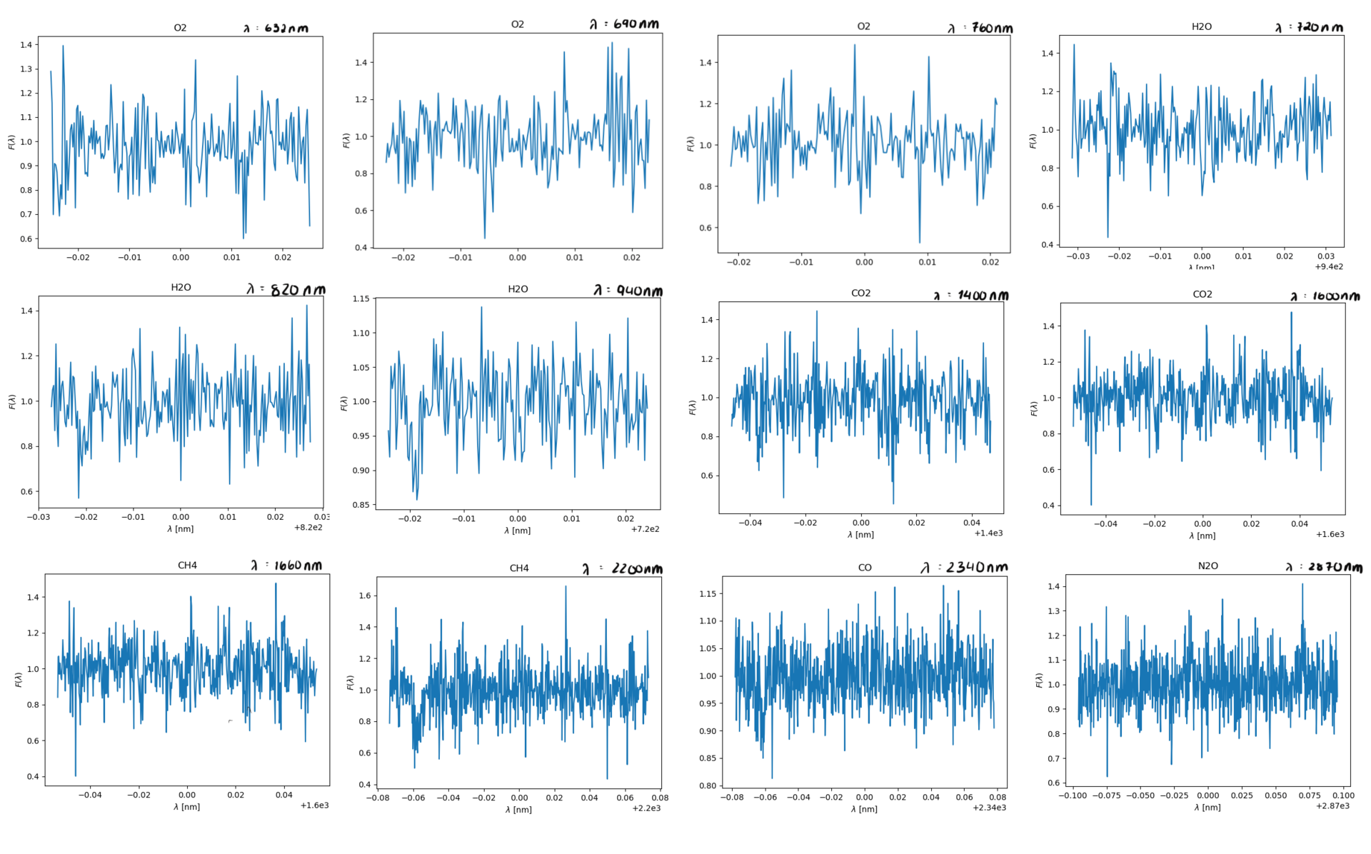
Your spacecraft has been equipped with a flux meter capable of measuring the flux of light with wavelengths between 600 nm and 3000 nm. The flux meter began collecting data as soon as your spacecraft entered the low orbit.
With 10 km/s as upper boundary for the spacecraft's velocity with respect to the planet during the time when it observes and takes the spectra of the atmosphere, we derived an expression of maximum per wavelength of interest.
\(\nabla\lambda_{max} = \frac{v}{c}\lambda_0\)
where:
\(v = 10 \text{ km/s}\)
\(c = \text{ speed of light}\)
\(\lambda_0 = \text{wavelength of interest}\)
And the so called wavelengths of interest are these
| Gas | Spectral lines [nm] | ||
|---|---|---|---|
| O2 | 632 | 690 | 760 |
| H2O | 720 | 820 | 940 |
| CO2 | 1400 | 1600 | - |
| CH4 | 1660 | 2200 | - |
| CO | 2340 | - | - |
| N2O | 2870 | - | - |
The reason for why some slots are not filled in because every gas does not necessarily have three spectral lines.
In order to use this data to find the actual gases we need to model the spectral lines using gaussian line profile. We'll do a quick revision of this since our last coverage of it was lackluster at best. The gaussian line profile is, put in simple terms, a way complex random systems tend to distribute. exaples of this is the velocity of particles in a gass as we've mentioned earlier, iq is another such distribution. The bell curved shape to the graph tells you something about the probability of something being withing a certain area of the graph, however pinpointing an exact speed of a particle is near impossible as the smaller on an interval within the curve we look at, the smaller the probability of it being there. An alanogy for this would be if you made 1 000 000 people run 100m dash, and say 36% of these (360 000 of them) had a time between 26 and 35 seconds. Say now you had to find the one person who ran the race in exactly 27.893434s, this is the equivalent of finding an exact velocity. However you know quite exactly how many people ran between the two times due to the gaussian distribution. I'll give a quick recap of how we get spectral lines, then I'll tell you how this is relevant to us in the spectral line analysis.
As you probably know spectral lines are caused by electrons in the shells of atoms and molecules absorbing very particular wavelengths of light and jusping to a higher energy level. These energyleves are extremely precice and differences in wavelength as small as nanometres can have no interaction with the electron. However once an electron does get excited it jumps to a higher energy level, it won't stay here for long though, and once it deexcites and jumps down to its base level it will emmit the light. The important thing to note about this emmission, however, is the direction will be completely random, and this random direction of the light they send out is the reason we get absorption lines. But shouldn't these lines be near invisible, since the wavelength is so precice you may ask yourself, the answer is yes, but only if the gass particles are at rest!
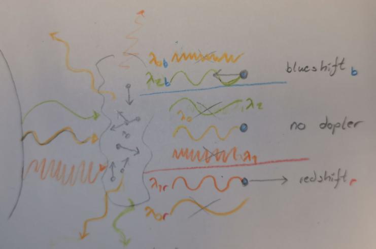
You see since particles within the gass have motion they will experience a doppler effect in relation to the light, some will move away from the source, some will move against. And if you recall since the distribution of velocities in a gass are such a complex system, they distribute in a gaussian fashion. And this is reflected in the absorption line as the dopler shift in light makes the atoms and molecules absorb slightly different wavelenghts slightly above- and bellow the wavelength of an atom or a molecule of the same type at complete rest. This means we get a simular gaussian distribution of absorption around \(\lambda_0\)(the actual absorption line of the gass at rest) as seen in the imiage to the left. The redshifted gass will absorb slightly shorter wavelengths of light and vice versa for the blueshifted one. And, as mentioned; since the velocities follow a gaussian distribution, so will these variances in absorption!
Using our knowledge about Gaussian distribution we can derive an expression for standard deviation of the line profile \(\sigma\) as a function of the gas temperature T, the mass of a particle in the gas m and central wavelength of the spectral line \(\lambda_0\).
First of all we have FWHM (full width half maximum) which can be expressed as1
\(FWHM = \frac{2\lambda_0}{c}\sqrt{\frac{2\textit{k}Tln2}{m}}\)
FWHM is a method of finding standard deviation (well approximated \(\sigma\)) as well. Here is how: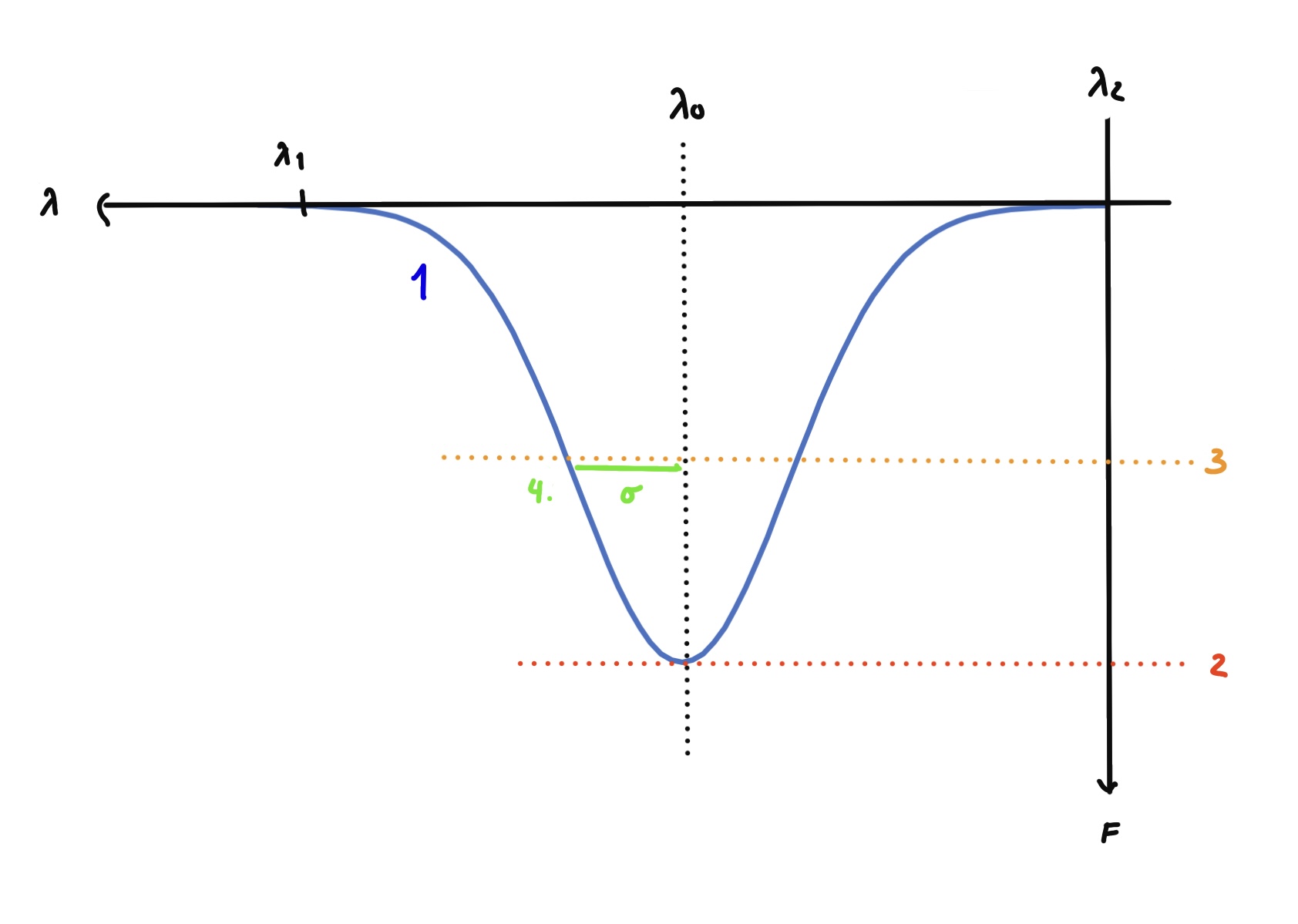
1) Look at the Gaussian line distribution
2) Find the critical point on the curve
which will be the highest or lowest point depending on what you're looking at.
3) Go down to half the height of maximum amplitude as seen above
4) \(\sigma\) can now be found by drawing a line from the Full Width Half Maximum (which is half the way up the line \(\lambda_0\) formes to the critical point) to the line distribution, the formula is detailed bellow.
Tada! Full Width Half Maximum (FWHM)
and we know standard deviation \(\sigma\), which tells us the area of the spectrum in which 68% of the distribution will lie. Basically, 68% of the gass moves with a velocity within this range, allowing it to absorb wavelengths of that type. This can be expressed using the FWHM we just found:
\(\sigma = \frac{FWHM}{8ln2}\)
If we write the FWHM from above the visualisation out we get:
\(\sigma = \frac{\lambda_0}{4ln2c}\sqrt{\frac{2kTln2}{m}}\)
What a mouthful!
Now for how you find these absorption lines analytically; the chi squared method. We touched upon this briefly at the end of Opening your third eye, however this explanation doesn't really detail what the differences and detail of the method is, so we'll be expanding that here.
Firstly, why does it matter if the graph is in the middle of the curve or off to the sides? Well, it again comes back to this gaussian distribution, if we were to measure only the noise in the system (\(\sigma_i\)) we'd expect there to be as many lines above F = 1 as bellow, this is, again, because the noise is a complex system and will distribute itself in a gaussian manner on both sides of F, in other words equally above and bellow. Additionally it is also the least distance between the maximum and minimum point of the observed graph, which is where \(\chi^2\) comes in. The way \(\chi^2\) helps us here is by telling us when this deviation is the smallest, ergo when the graph has as large a portion of the spikes above it as bellow it, which is what we wish to find.
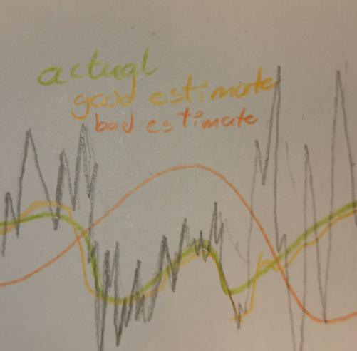
This is probably best illustrated with an image, which you'll see to the left. The orange graph which is clearly off from the green, noiseless, graph, and we can tell by looking at it that the deviation between it and the spikes is meanigfully greater then the yellow graph, which is a much better approximation, now this is hand drawn, but the point is the closer to the actual graph you lie the smaller the sum of deviations above and bellow the graph should be.
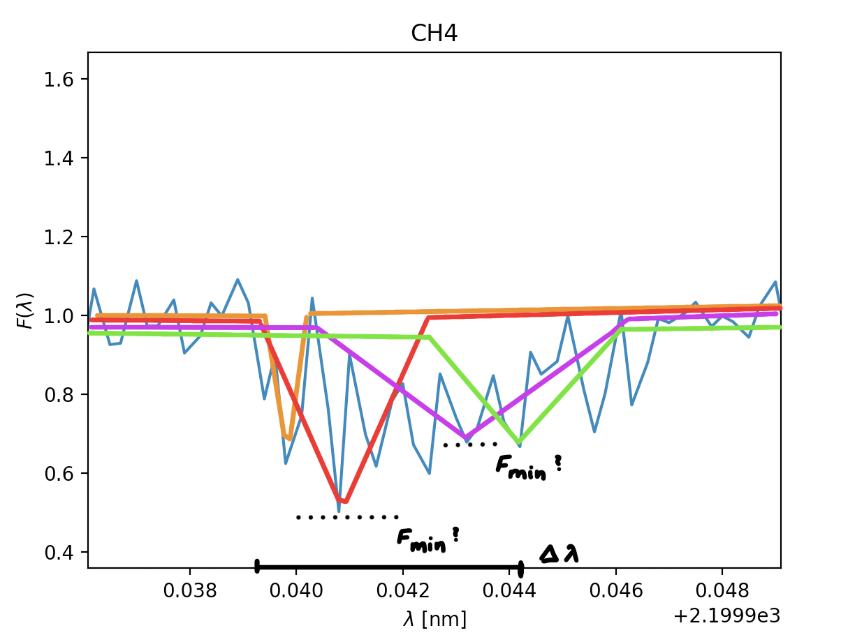
Now to explain the formula in slightly more detail; \(\chi^2=\sum\limits_{i}[\frac{f_{obs}-f_i}{\sigma_i}]^2\), fobs is the observed signal, in simpler terms the spiky part. This part cannot be changed, but is what we compare our models with. fi is our modell, this is where we can vary the lowest point in the graph known as Fmin (2) and where we can vary where the position of said lowest point will be \(\lambda_0\). When executing this method you'd take a bunch of different Fmin- and \(\lambda_0\)-values, in order to get the smalles number possible in \(\chi^2\). But this is just the same as in the method of least squares, we already get the gist of what this is about, just some specificity as to what we're varyiong within the formula. However, I've neglected to mention a very critical component which makes \(\chi^2\) noticably different from the method of least squares, and that's \(\sigma_i\). Why bother with it? Why do we need to divide by a noise component which changes along the graph instead of remaining constant? Well, the main goal of it is to lessen the imput the noise has on the deviation in the method, meaning areas with immencely large preaks from the central value are paid less attention to. In our case we want to find dips in the graph equal to 0.7 or lower, as this means light has been absorbed, but if the noise is loud enough in the area the graph can easily drop bellow 0.6 and rise above 1.4, in cases like this we want these values for potential dips to be weighted less, as it's frustrating to get a sucessful output every time the graph is a bit noisy. One of the drawbacks to this, however, is that in areas where there is an actual dip, but where the noise is large enough the dip might be overlooked.
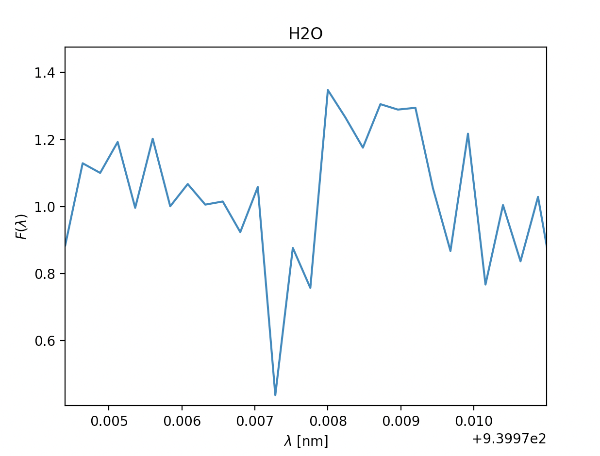
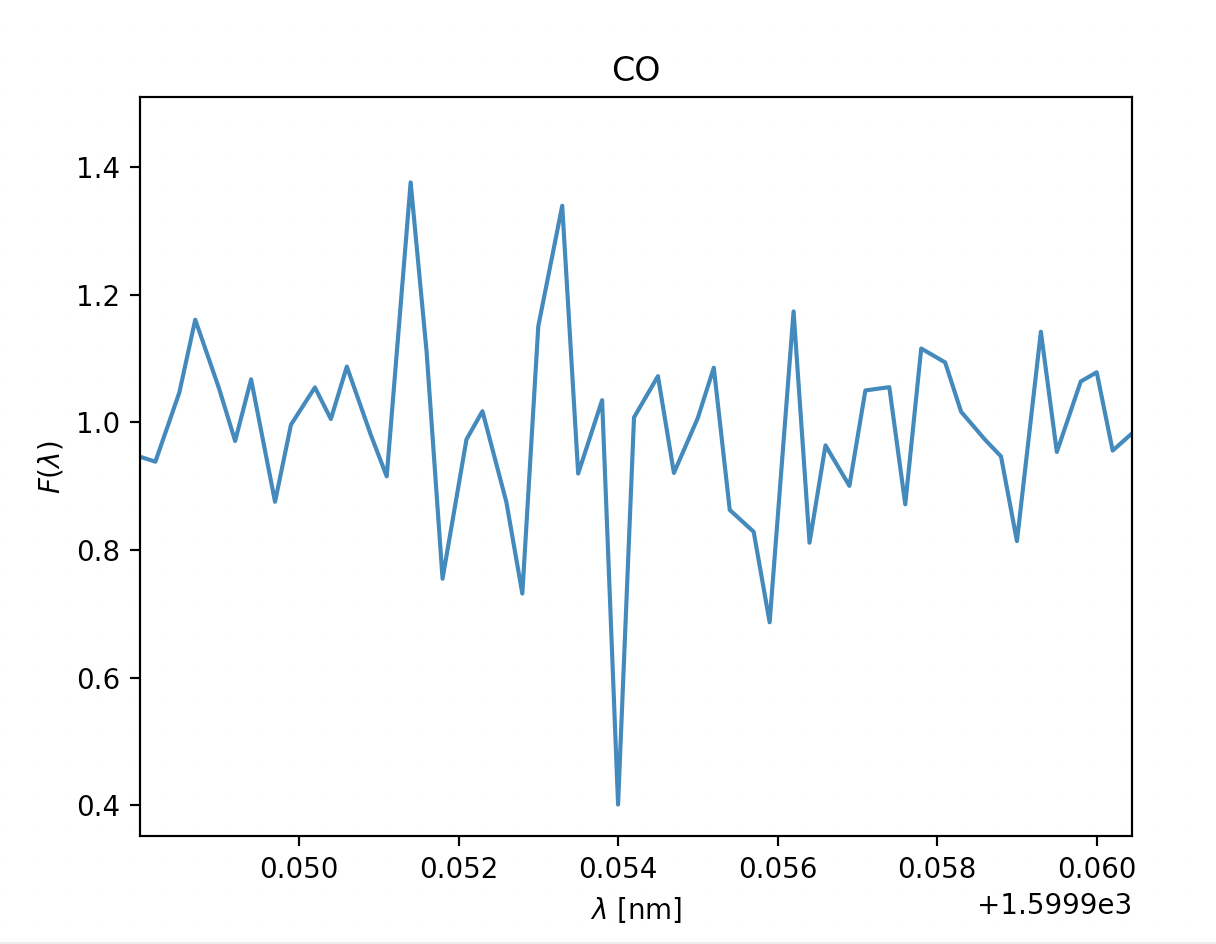
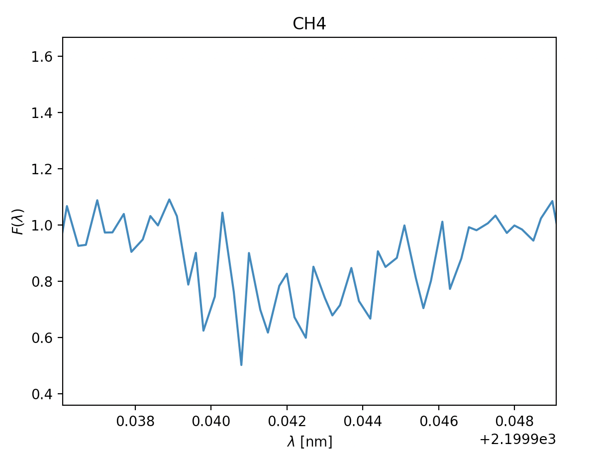
Now we know how to find the absorption lines in the gass, and how we find \(\sigma\). Next we can start analysing our results to determine if the absorption line is a plausible one or not, the general premises of this as well was detailed in Opening your third eye, now we're looking at in from the formula side of things. This next part is mainly relevant for ehrn we've found multiple spectral lines for the same type of gass, for the gasses where we only find a single spectral line we're just going to have to chance it being there or not, if we are in doubt of course. To find if the gass has approximately the same velocity we can look at \(\lambda_0\), this tells us how quickly the gass is moving compared to our spacecraft, and it should fall within a reasonably small area if we have spectral lines of the same gass, you can see this if you look at the x-axis for H2O bellow this for the spectral lines at 820nm and 940nm. Where the leftmost graph at 820nm can be eliminated due to being so far off compared to its counterpart. Once we're done with this we can move on to finding the temperature of the gass. As mentioned earlier we'll need \(\sigma\) for this, note that this is not the same \(\sigma\) as the \(\sigma_i\) in \(\chi^2\). \(\sigma\) dscribes an area of probability in our gaussian distribution while \(\sigma_i\) describes the magnitude of the noise in our readings. Using the expression for \(\sigma\) above we get \(T= \frac{\lambda_0k}{8mc^2\sigma^2ln2}\) (alternatively also possible to use FWHM to find T here). Once we have the temperature we have two things to reflect before concluding if the gass is present in the atmosphere or not. If the temperature is so far bellow 150K or above 450K that it can't be due to noise in our measurements, the gass is not present. The other aspect to consider is if gasses of the same type are about the same temperature, if they vary beyond reasonable amounts caused by noise at least one of them is not present.
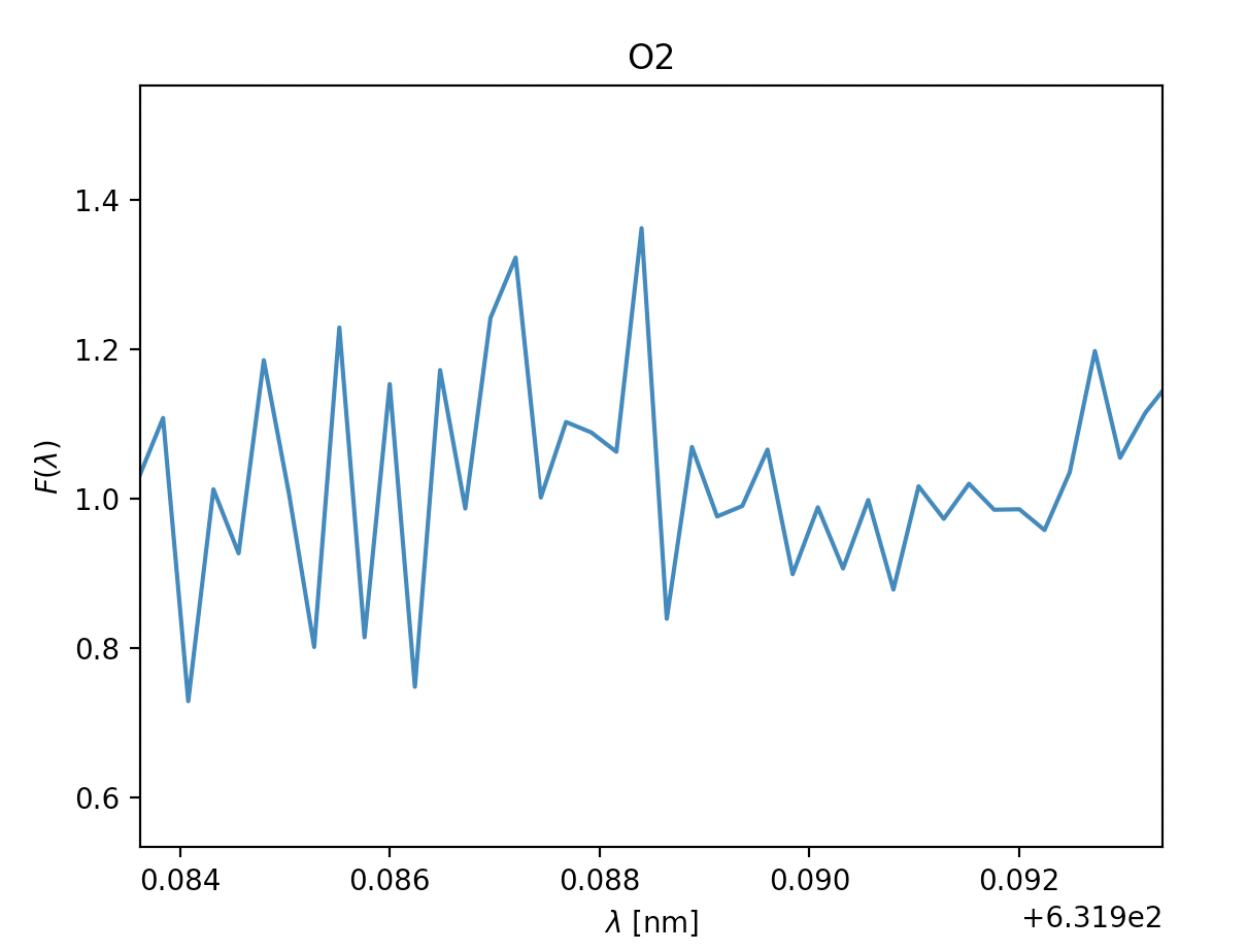
Example of data which is obviously not a possible spectral line; this is because it dips and rises pretty equally above and bellow F=1, in addition to being centered arounf F=1 and never dipping bellow 0.8.
Here is an illustration of how the graph varies if we use the upper and lower estimates of Fmin and \(\lambda_0\).
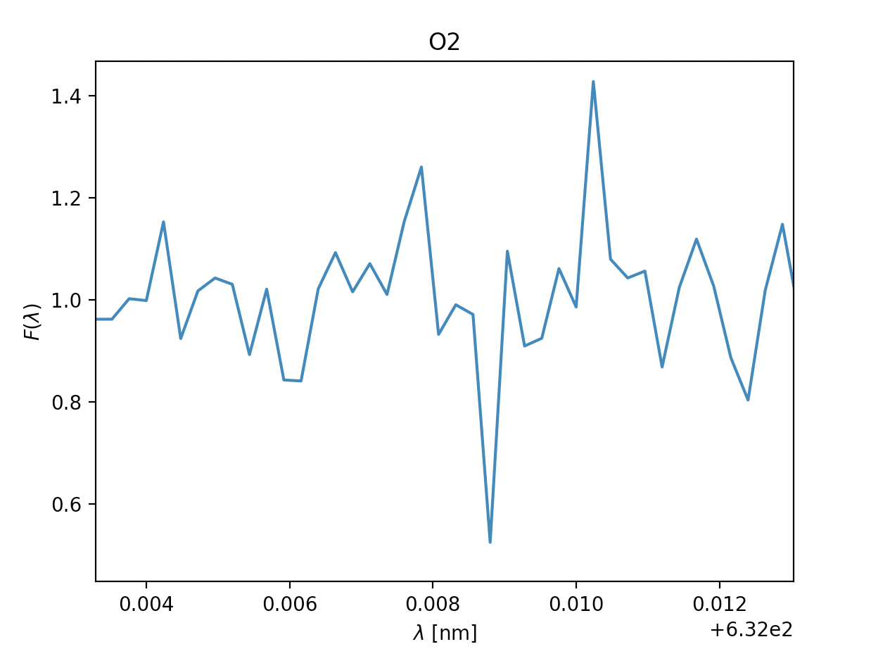
- \(\text{Oxygen } O_2\), \(\lambda = 632 \text{nm}\) \(\text{Oxygen } O_2\), \(\lambda = 632 \text{nm}\)
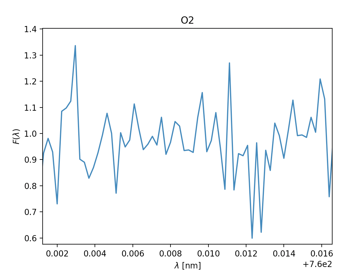
- \(\text{Oxygen } O_2\), \(\lambda = 760 \text{nm}\)
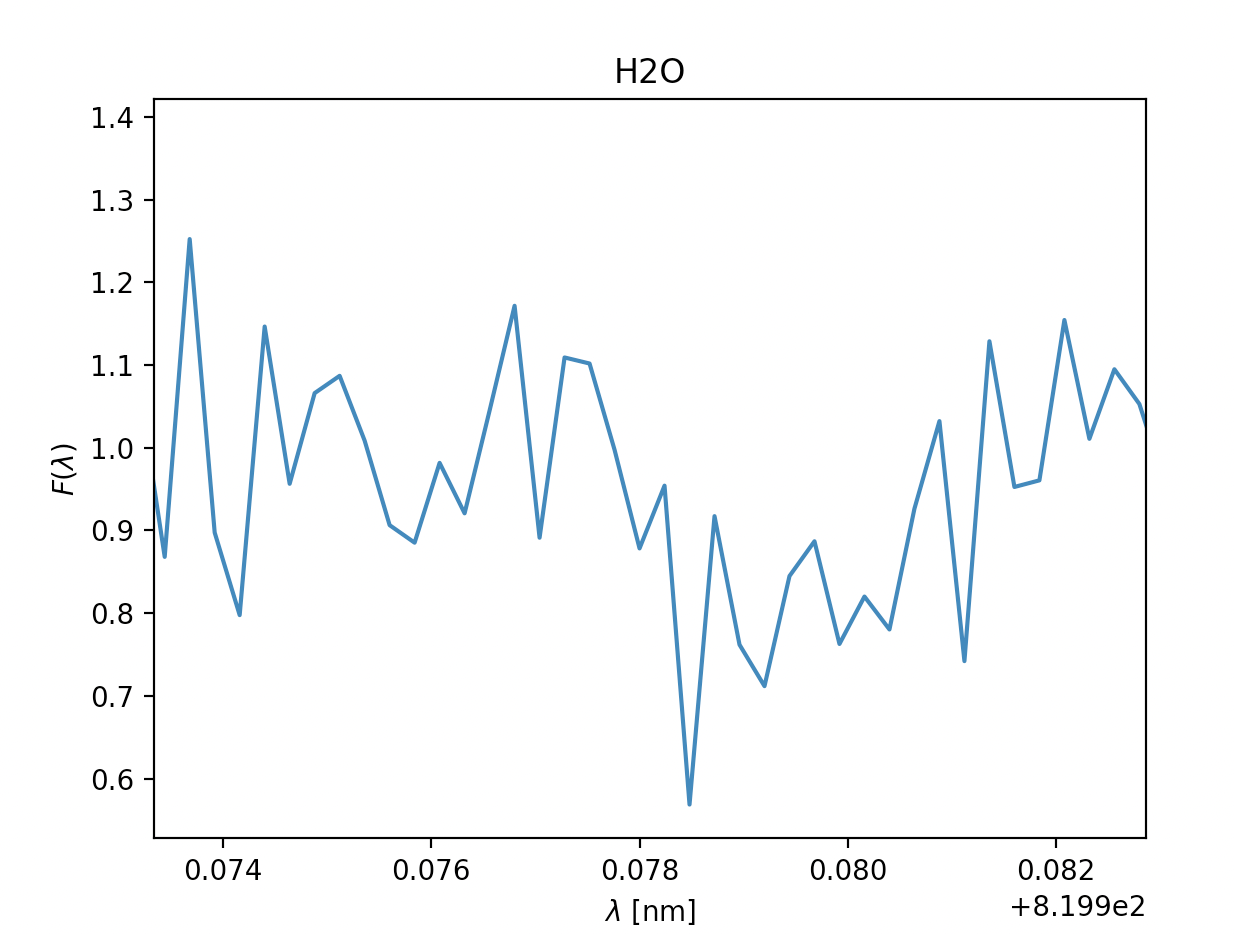
- \(\text{Water }H_2O, \lambda = 820 \text{nm}\) \(\text{Water }H_2O, \lambda = 820 \text{nm}\)
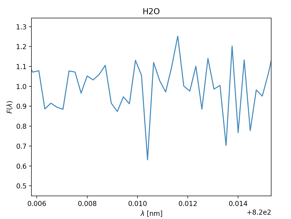
- \(\text{Water }H_2O, \lambda = 940 \text{nm}\)
- \(\text{Carbondioxide }CO_2, \lambda = 1600 nm\)
- Methane CH2, \(\lambda =1660nm\)
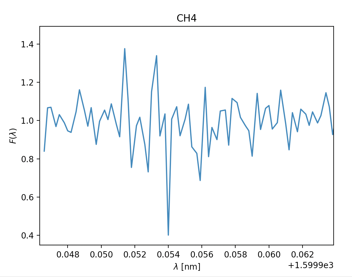
- Methane CH2, \(\lambda =2200nm\)
Now let's quickly analyse these.
Due to some faulty file reading of the data-files on our spacecraft's backup tcomputing device, we were unable to depict som approximations in the readings above, however the ones with a green title are the ones we suspect are in the atmosphere, due to:
- how far down they dip, even when the readings are noisy (Fmin satisfied)
- the readings having multiple measurments after one and other dip (\(\sigma\) representing the temperature in the gass)
- the relative velocity to the spacecraft being fairly similar where relevant (\(\lambda_0\) being fairly similar, and thus the velocity)
The titles with yellow writing, however, have some doubt is they are there. This may be due to them having a way to sharp dip, the points next to the dip not dipping, too many points in a row dipping or the doppler shift and thus the velocity being different. However, due to the faulty equipment we didn't have time to check the temperatures thoroughly, so our estimates are pretty potimistic. We can, however get a general idea by looking at the width of the dips, on the comparison side, H2O and O2 have pretty similar widths within their respective gass, meaing the temperature is probably pretty similar. Additionally the dips are fairly wide, meaning the gasses will probably be a reasonable amount above 150K. In CH4 and CO2's case the dips are very slim, meaning the temperature of these gasses probably lies closer to 150K, though if it is unreasonably bellow is hard to tell without being able to model it.
What on earth could've happened to those files? I can swear they were here just a moment ago, all I remember was a sudden flash of light and vaguely a rounded figure in a suit darting off, it couldn't've been... Nevertheless, although we're unable to simulate exactly, this won't thwart us! We are as stubborn as we are jiggly now off we go to model!
The actual model of the atmosphere looks similar to our assumption model, with the only difference being the height where \(T = \frac{T_0}{2}\). The transition phase between adiabatic and isothermal is at a higher altitude for the actual model.
Sources: